Creating A Visual Impact On Your Next Project
Which Colors Should I Choose for My Building?
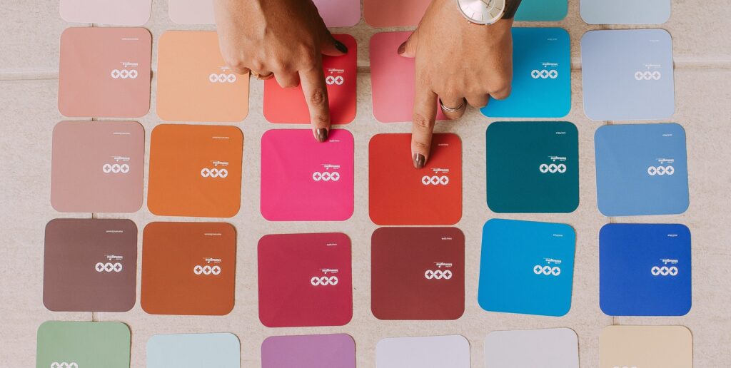
Have you ever wondered why building owners choose the colors they do? If you have your own building project in mind, you might be wondering, “Which colors should I choose?” As a general contractor in Central Florida, McCree knows the central importance of color in branding, architecture, and design. Color plays an essential role to creating a visual impact or subtly appealing to a range of tastes and emotions. Colors influence us in ways we don’t always realize, lending specific moods to create distinct and purposeful atmospheres. To help you choose which colors are right for your project, here is a list of their common connotations.
Red: The Attention-Grabber
Red turns more heads than any other hue. It’s a bold, exciting color linked with strength, determination, passion, and excitement. It exerts a special dominance and is known to heighten energy levels. Red also attracts customers and stimulates appetite—restaurants love to use it. To bring business to your restaurant, this is the color you want to emphasize!
Business that use this color: Coca-Cola, McDonald’s, Netflix, Levi’s, Time Magazine
Orange: The Optimist
Pleasurable and winsome, this color wields high persuasive power. It inspires enthusiasm, encourages freedom of expression, and fosters a friendly environment. If you want to create a laid-back, welcoming school campus in Orange County, you can’t go wrong with orange.
Business that use this color: The Home Depot, Reese’s, Fanta, Harley Davidson, Amazon
Yellow: The Stimulator
This is the brightest color of all. It radiates positivity and, like red, is said to raise energy. It also helps to heighten awareness and enhance mental clarity. To give your commercial property a cheery, mindful aura, yellow is second to none.
Business that use this color: Hertz, SubWay, Best Buy, Sonic, Post-It, Lays
Green: The Connector
Widely held as the color of life and nature, green also connotes harmony as well as purity, health, and luck. It is the color of connection—our connection with the earth and with each other. For that reason, you could call it the color of community. If a lively, peaceful vibe is what you want for your café, nothing does the job like green.
Business that use this color: Starbucks, Spotify, Heineken, Whole Foods, Holiday Inn
Blue: The Confidant
This color emanates calm and reassurance, even to the point of slowing heart rates. It brings connotations of power, trust, and security; for this reason, you can find it in many government buildings. Blue also conveys a strong sense of purpose and sturdiness, making it a feature in churches around the world. To bring a relaxing ambience to your medspa, blue is the choice for you.
Business that use this color: Facebook, Chase, Blue Cross Blue Shield, Oral-B, Dell, Lowes
Purple: The Magician
Rivaled only by red for its eye-catching quality, purple is a wonderfully striking color. Due to its rarity in architecture and design, it always gets noticed. Purple has ancient cultural ties to royalty and luxury, as children of emperors were said to be “born in the purple.” Because of this, purple lends an air of elegance even today. This color also brings connotations of spirituality, wisdom, justice, and imagination. If class and sophistication are what you have in mind for your concert hall, purple is your answer.
Business that use this color: Roku, Monster, Taco Bell, FedEx, Hallmark, Twitch
Brown: The Anchor
Brown is the earthiest color aside from green. It is also the most timeless, going back to the first wooden structures. Brown is a serious, grounded color that combines the stability of blue and the wisdom of purple. It also suggests resilience, simplicity, and honesty. If you want to evoke a sense of safety, transparency, and dependability, you cannot go wrong with brown.
Business that use this color: M&M’s, UPS, Cracker Barrel, Hersheys, Louis Vuitton
Black: The Commander
Black is arguably the most intriguing color. It provides more mystique than purple and adds a flavor of power. Black is formal, conveys authority, and commands respect. For a sleek, refined, and prestigious environment, black is number one.
Business that use this color: Nike, Adidas, Sony, Gucci, Apple, Uber
White: The Clean Slate
White can bestow a fascinating blend of meanings. Its universal overtones of cleanliness, order, and efficiency explain its prevalence in medical offices around the world. Along with bringing feelings of innocence and elegance, it even has a decluttering effect on the mind. To produce a sense of serenity and sterility, white is your best bet.
Business that use this color: Tesla, Mini, Crocs, BBC, The North Face, Paramount
Whether you’re building a restaurant in Orlando, a clinic in Kissimmee, or a government building in Tampa, color is imperative to creating a visual impact for your design. It influences visitors as soon as they enter and establishes the specific mood you seek—be it comfort, liveliness, or stature. But sometimes you arent quite sure where to start? If you need some quick inspiration we recommend checking Adobes free color palette options that easily help you create the visual impact basis for your next meeting.
For any questions, feel free to reach out to McCree! We would be honored to learn about your vision and help you bring your project to fruition.